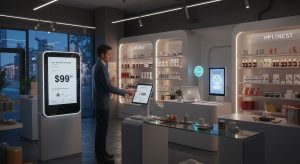
Picture this: a customer walks into an adult store, eyes scanning shelves packed with pleasure products. One box catches their attention—not because it screams with neon rainbows, but because it feels like it was made for them. That’s the power of inclusive packaging. In an industry built on desire and self-discovery, how a product is presented can make or break the connection. With 72% of U.S. consumers admitting packaging sways their buying choices, brands can’t afford to half-ass this. Especially when it comes to the LGBTQ+ community, where authenticity isn’t just nice—it’s non-negotiable.
Let’s get real. The adult industry thrives on intimacy, but too many brands still slap pink or blue on their boxes and call it a day. That’s not just lazy; it’s alienating. Inclusive design isn’t about pandering—it’s about showing up for your audience with intention. From queer couples to trans folks, every customer deserves to feel seen. So, how do you nail it without coming off as performative? Let’s break it down.
Why Packaging Matters in the Pleasure Game
Pride Month might amplify the spotlight, but inclusivity isn’t a seasonal trend. It’s a year-round hustle that starts with a box. Packaging is your brand’s handshake—your first chance to say, “This is for you.” Done right, it builds trust, sparks loyalty, and turns a one-time buyer into a fan. Done wrong? It’s a missed shot that screams “we don’t get you.”
Ditch the Gender Trap
Gendered packaging is a relic. Those curvy pink boxes for “ladies” or rugged blue ones for “guys”? They’re not just outdated—they’re a turn-off. Go for gender-neutral design instead. Think matte black cylinders, soft gradient pouches, or minimalist cubes. These scream sophistication while letting every customer—gay, trans, nonbinary—claim the experience. Swap out rigid shapes for fluid curves and ditch binary color schemes for bold neutrals or moody hues like plum or jade.
Want to level up? Toss in customizable touches. A sticker pack with abstract designs or a blank “for/from” note lets buyers make it personal. It’s a small move that screams, “We see you.” In a retail setting, that’s the kind of detail that gets a box off the shelf and into someone’s hands.
Speak Their Language—Literally
Your packaging’s words are your brand’s voice. Make it welcoming. Ditch terms like “for men” or “for women” and lean into anatomy-based phrasing. Try “crafted for vulva stimulation” or “perfect for prostate play.” These aren’t just inclusive—they’re precise, focusing on sensation over identity. Phrases like “made for penis owners” cut through assumptions and let customers feel understood.
“Language on packaging can make someone feel instantly included or totally ignored. It’s about clarity and respect.”
– Anonymous Adult Retail Manager
Add QR codes linking to guides or videos tailored for diverse bodies. Emboss words like “Explore” or “Celebrate” on the box for that tactile vibe. It’s not just about selling a sex toy; it’s about inviting everyone to the party with confidence.
Visuals That Actually Represent
A picture’s worth a thousand words, and in adult retail, it’s worth even more. Stock photos of cookie-cutter models? Pass. Go for queer-inclusive imagery. Illustrations, silhouettes, or abstract motifs can nod to queer aesthetics without leaning on tired rainbow clichés. If you’re using photos, show real diversity—queer couples, body-diverse folks, trans and nonbinary representation. It’s not tokenism; it’s reality.
Authentic visuals do more than look good. They signal your brand gets it. On a shelf, that’s the difference between a customer reaching for your product or walking away. Check out how brands like Lovehoney use inclusive imagery to pull in diverse crowds without overplaying the Pride card.
Don’t Just Slap on a Rainbow
Pride-themed packaging can hit hard, but only if it’s backed by substance. Customers sniff out performative BS faster than you can say “limited edition.” A rainbow logo with no follow-through? That’s a hard pass. To make it real:
- Share your brand’s values or highlight LGBTQ+ initiatives on the box.
- Feature quotes from queer team members or collaborators.
- Link to resources or nonprofits, like The Trevor Project, that you actually support.
Integrity trumps flash. A subtle design with real commitment resonates louder than a glittery one-off.
Team Up With Queer Creatives
Want packaging that slaps? Bring in LGBTQ+ designers. Their lived experience ensures your design isn’t just pretty—it’s authentic. Tap queer collectives or run a Pride design contest to co-create a limited-edition box. Highlight the artist’s story on the packaging. It’s a win-win: you get fresh designs, and the community gets a platform.
Not sure where to find talent? Start with inclusive creative directories or local queer networks. The investment pays off when your packaging feels like it was made by someone who gets it.
Inclusion Doesn’t Stop at the Box
Great packaging sets the vibe, but the retail experience seals the deal. Train staff to be approachable and knowledgeable about diverse needs. Merchandise smart—group products by function or sensation, not gender. A shelf labeled “prostate play” or “clitoral vibes” feels way more inviting than “men’s toys” or “women’s toys.”
It’s about creating a space where everyone feels safe to explore. That’s where loyalty is born.
Listen, Learn, Repeat
The best brands don’t guess—they listen. Run focus groups with queer customers to test your packaging. Ask retail teams for frontline feedback. Drop a QR code on the box for post-purchase surveys or encourage unboxing videos on social. When you treat packaging as a conversation, your community helps you level up.
One brand I know tweaked their box design after feedback from trans customers pointed out gendered language. The result? A 15% sales bump and a flood of positive reviews. Listening pays.
Make Pride a Lifestyle, Not a Campaign
Pride Month is a spark, but inclusivity is the fire. Brands that weave queer representation into their DNA—hiring, designing, marketing—build the deepest loyalty. Your packaging is just the start. Keep pushing for inclusion every damn day. When your box says “you belong” and your actions back it up, that’s when you’re not just selling pleasure products—you’re building a community.